

Hunt Club is an executive recruiting firm powered by data, tech, and networks— connecting businesses with top-tier leadership talent outside of their normal reach.
During my time at Hunt Club, I worked on a 10-person marketing team, contributing across a wide range of marketing collateral. Our largest initiative was the creation and rollout of a full company rebrand. To establish the initial creative direction, we partnered with CōLab Group—an agency known for shaping the brands of companies like Slack and Airbnb. Under the leadership of our VP of Marketing, our content and design teams carried the rebrand forward, developing a completely new brand language and visual identity.
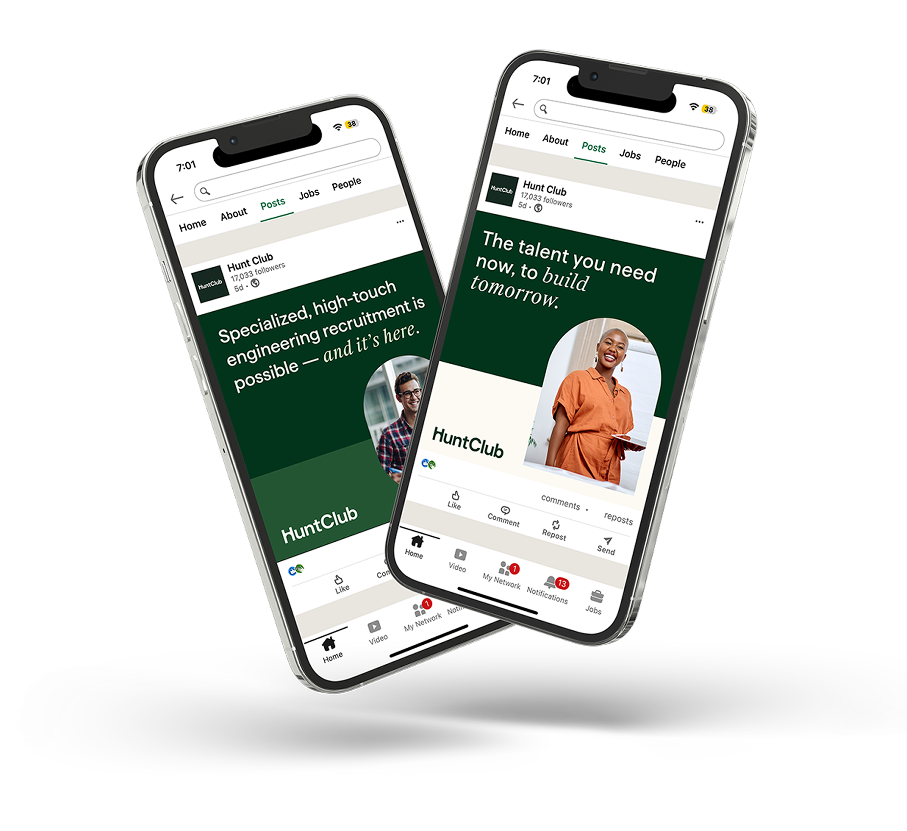
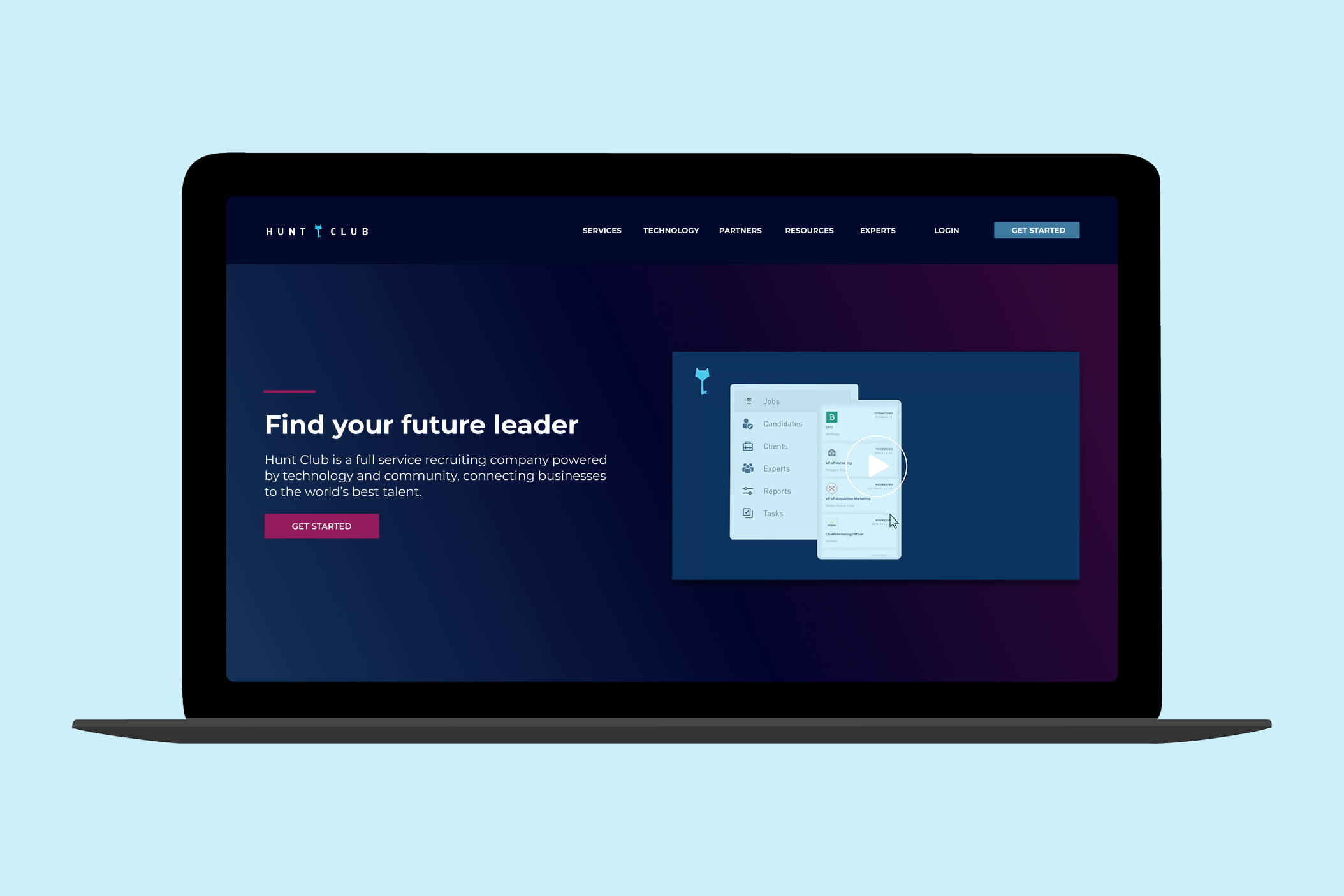
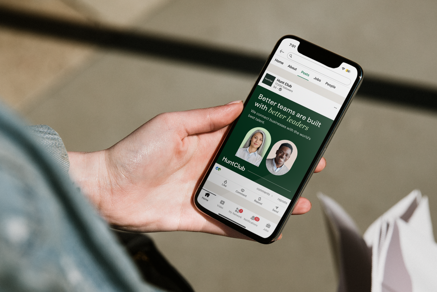
Hunt Club’s previous brand felt juvenile and didn’t reflect the warmth of the human connections at the core of the company’s model. The visual identity leaned heavily into a tech-centric aesthetic—through its color palette, imagery, and tone—which didn’t convey the personalized, relationship-driven nature of our approach. The new brand needed to communicate that Hunt Club facilitates warm, trusted introductions through its proprietary network, and it had to resonate with both primary audiences: the companies seeking talent and the candidates exploring new opportunities.
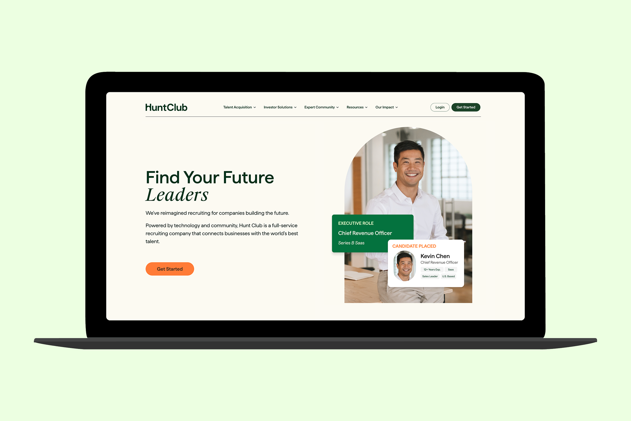
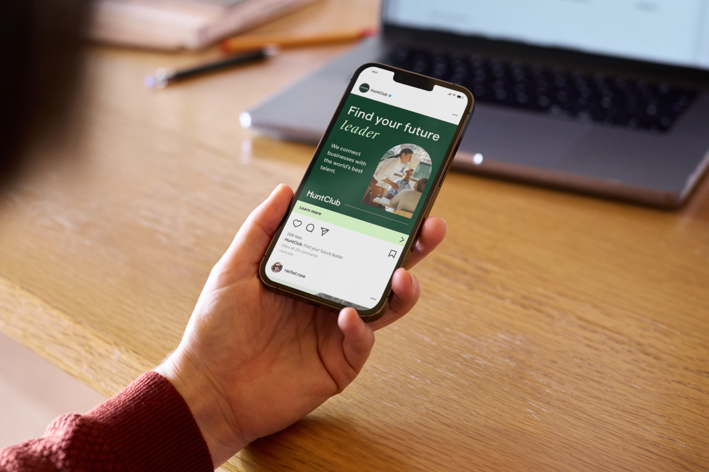
The new brand identity embraces a warmer, more human tone through updated color palettes and typography. Two symbols—a bridge and a door—serve as the foundation of the visual system and are integrated into the “H” logomark. The bridge represents the connections we create between companies and exceptional talent, while the door symbolizes opening opportunities for candidates. Our new tagline, “Find Your Future,” speaks powerfully to both sides of the marketplace.
This rebrand also evolved the original visual concept: the legacy brand centered on a key symbolizing access to opportunity. We replaced the key with a door—an approach that feels more inclusive and universally accessible—reinforcing the idea that Hunt Club helps open pathways for everyone involved.
.png)
My contributions helped strengthen Hunt Club’s visual identity and unify the brand across digital, print, and experiential touchpoints. I played a key role in the rebrand rollout—supporting CōLab Group’s creative direction while translating the new identity into functional, scalable assets. I lead multiple design initiaives such as sourcing and developing an entirely new icon system and curated a library of 500+ brand images used across the website, blog, email campaigns, advertising, and product materials. Working closely with my creative director, I worked on rebranding all existing marketing collateral and produced new pieces as needed, spanning brand, digital, sales, content, and event collateral.
.png)
.png)
I collaborated closely with my team to shape and refine the new brand visual language. I led several core design initiatives, including developing a cohesive iconography system and curating a library of 500+ images to support marketing, product, and web needs.
Rolling out the new identity required updating internal and external assets in parallel. I partnered with the Creative Director to manage the transition in phases—refreshing materials, ensuring consistency, and equipping every team with the assets they needed.
Sales, Product, and Marketing each required ongoing design support with competing priorities. Using Monday as a workflow and project management tool, I maintained an organized pipeline and enabled smooth, timely cross-team collaboration.
.png)
This work is presented for portfolio use only. All brand assets and photography are the property of Hunt Club. Photography shown includes both Hunt Club–owned imagery and licensed Adobe Stock photography.